

Performance Test Result Analysis – Basic Level
Any performance test’s main objective is to clearly state the application’s performance status and to locate performance problems (if any). Performance Test Result Analysis is essential since a poor forecast or the choice to launch with risk may have an adverse effect on sales, brand recognition, consumer perception, and user experience. Therefore, it’s crucial to understand:
- How to read the graphs?
- How to merge the graphs with other graphs and metrics?
- How to conclude the result by analyzing the graphs and numbers?
- How to make a Go/No-Go decision of an application?
In order to assist you understand how to begin the analysis phase of performance testing, let’s start with some fundamental graphs and terms. Given that you have read the key principles in the previous essay, take them into account before beginning the analysis of any performance test.
1. User Graph
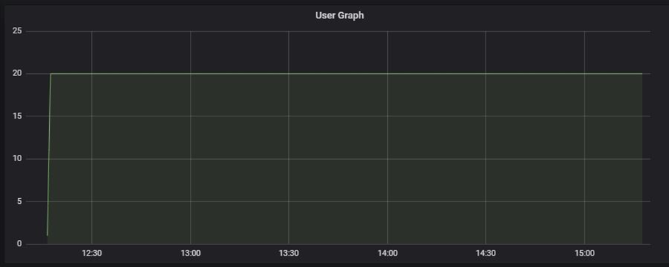
Complete details about the load patterns during the test are provided through a user graph. This graph aids in determining:
- When did the user load start?
- What were the user ramp-up and ramp-down patterns?
- When did the steady-state start?
- How many users were active at a particular time?
- When were the users exited from the test?
The name used to describe the user graph in each performance testing instrument is different:
- LoadRunner: Running Vuser Graph
- JMeter: Active Threads Over Time Graph
- NeoLoad: User Load Graph
2. Response Time Graph
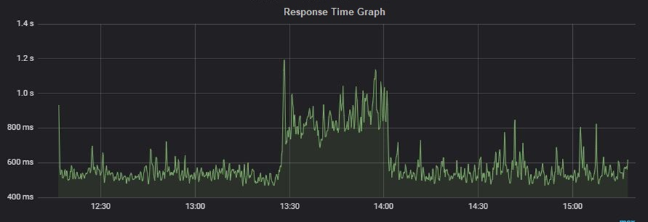
The response time graph provides a clear image of the whole amount of time required, including the time spent requesting a page, processing the data, and responding to the client. In general, a website’s response time for a typical user load might range from 1 to 5 seconds, however, for a web service, it might even be milliseconds or less.
Types:
- Request response time: One shows the response time of a particular request on a webpage.
- Transaction response time: It shows the time to complete a particular transaction. Just to remind you a transaction may have multiple requests within it.
A Response Time graph provides information about:
The average response time of request/transaction
Min and Max response time of request/transaction
Percentile response time of request/transaction. Example: 90th, 95th, 99th etc.
Tool-specific term:
- LoadRunner: Average Transaction Response Time Graph
- JMeter: Response Times Over Time Graph
- NeoLoad: Average Response Time (Requests) & Average Response Time (Pages)
3. Throughput Graph
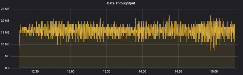
The data transmission rate from the server to the client per unit of time is shown in this graph. Bytes per second, KB per second, MB per second, etc. are units of measurement for the transmitted data.
To identify network-related issues like limited bandwidth, a throughput graph is employed. A decline in the throughput graph also indicates a problem with the server, particularly with connection pools and queuing. To determine if the problem is with network capacity or at the server end, the throughput graph has to be carefully examined in conjunction with other graphs.
Tool-specific term:
- LoadRunner: Throughput Graph
- JMeter: Bytes Throughput Over Time Graph
- NeoLoad: Total Throughput Graph
4. Hits per second Graph
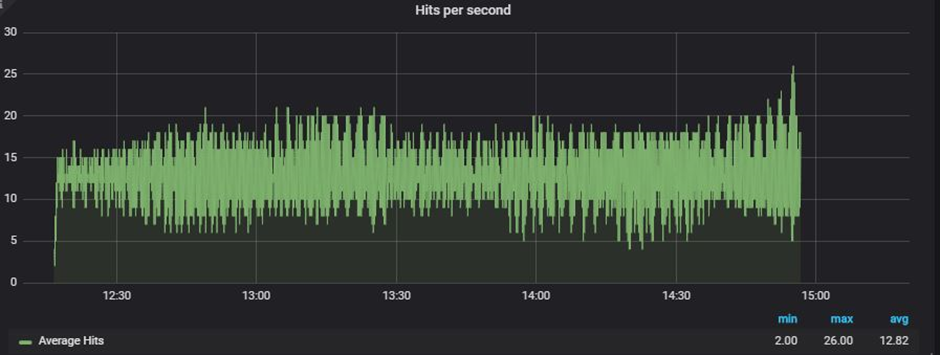
Per-second hits The term “graph” describes how many HTTP requests a user or users send to a web server in a second. Always keep in mind that, in terms of performance testing, there is a distinction between Transactions per second and Hits per second. A transaction is a collection of requests that results in several hits on the server, to give further specifics. As a result, you can notice several requests (hits) for a single transaction. The hits per second graph aids in determining the rate at which the testing tool sends requests. High response times could result in lower HPS.
Tool-specific term:
- LoadRunner: Hits per second Graph
- JMeter: Bytes Hits per second Graph
- NeoLoad: Total Hits Graph & Average Hits/sec Graph
5. Transactions per Second Graph
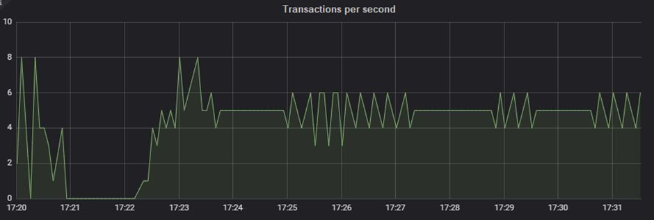
The TPS, or transactions per second, graph shows how many transactions are carried out each second. A graph of transactions per second (TPS) that is being monitored live during the test aids in keeping an eye on the transaction rate. If you have a TPS SLA, you must set up the workload model such that it can keep the specified TPS—neither more nor less—in place. TPS may be managed by timing the test scenario appropriately. Less TPS might result from a slow reaction time.
Tool-specific term:
- LoadRunner: Transactions per second Graph
- JMeter: Transactions per second Graph
- NeoLoad: NA
6. Error Graph
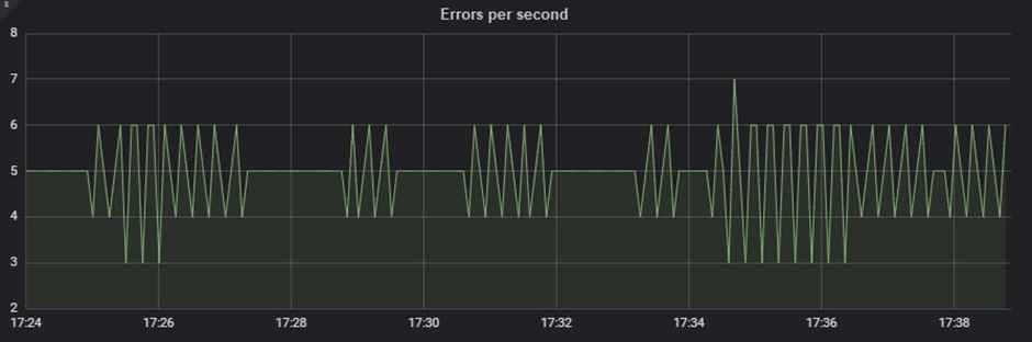
The number of mistakes found during the test is displayed on the error graph. Both descriptive and quantitative error graphs are possible. The descriptive error graph details the error message, which aids in identifying the reason, while the quantitative error graph displays the error count and incidence at a certain period. Combining the error graph with other graphs, such as the throughput graph, reaction time graph, etc., creates a clear picture and aids in locating the bottleneck.
Tool-specific term:
- LoadRunner: Errors per second Graph and Errors per second (by Description)
- JMeter: Error (in Tabular format) and Top 5 Errors by sampler
- NeoLoad: Total Error
7. CPU Utilization Graph
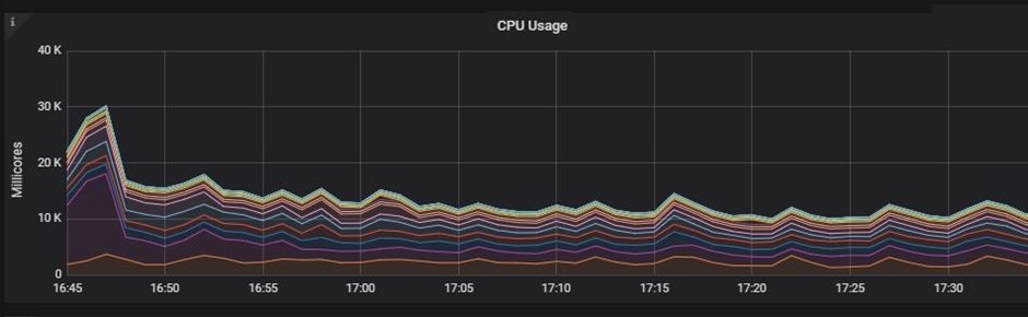
The first measure on the server side is the “CPU utilization graph,” which displays the proportion of the CPU that is being used. In order to compare utilization percentages, the data of server-side metrics are recorded for the pre-test, test, and post-test periods.
The resource utilization is recorded by the server monitoring program. One of the resources is the CPU. These monitoring solutions may be incorporated into the server, agent-based, or agentless.
8. Memory Utilization Graph

The memory utilization graph serves a similar function as the CPU utilization graph. The only distinction in this graph is that we examine the test’s memory condition. The system’s memory leakage may be found using the pre-test, test, and post-test periods. Monitors, which might be agentless, agent-based, or embedded into the server, record graphs of memory usage.
Conclusion:
Please be aware that the analysis steps listed above are extremely general and may help you grasp the fundamentals of performance test result analysis. A new performance tester can use this post to better grasp the phrases used in the analysis. The interpretation of performance test results is a fairly broad issue that requires both practical expertise and theoretical understanding. You may thus get the theoretical knowledge at Perftestpro and complete the practice independently. To get deeper into the analytical portion, see the next post.