
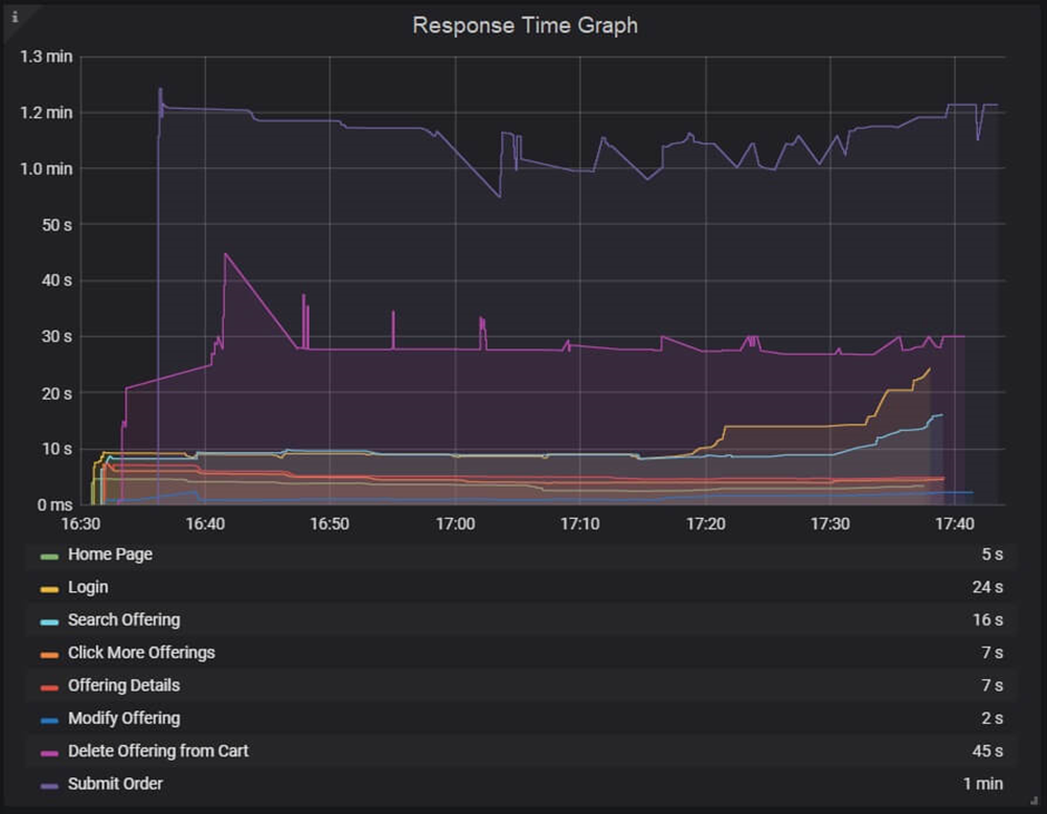
Response Time Graph
The response time graph provides a clear image of the whole amount of time required, including the time spent requesting a page, processing the data, and responding to the client. According to the Performance Test Life Cycle (PTLC), the reaction time NFRs should be reviewed and decided upon during the NFR collection phase and then contrasted with the actual response time that is seen throughout the test. The Step-up Load technique must be used when the application is brand-new and does not yet have any reaction time NFRs. You must record the response time pattern under various loads throughout the step-up test and share the data with the business analyst (BA) to gain assurance that the outcome is acceptable.
Although for a web service it is less than 1 second or even in milliseconds, a website’s response time typically ranges from 3 to 5 seconds with an average user load.
Type of Response Time Graphs:
You may get two types of response time graphs, one shows the response time of each request on a webpage whereas another shows the response time of the transactions. To remind you a transaction may contain multiple requests.
A response time graph may contain the name of transactions (requests), average response time, min and max response time, X%tile response time, etc.
A few of the terms used by various performance testing tools to describe the reaction time graph are listed below:
- LoadRunner: Average Transaction Response Time Graph
- JMeter: Response Times Over Time
- NeoLoad: Average Response Time (Requests) & Average Response Time (Pages)
Response Time Graph axes represent:
- X-axis: It shows the elapsed time. The elapsed time may be relative time or actual time as per the graph’s setting. The X-axis of the graph also shows the complete duration of the test (without applying any filter).
- Y-axis: It represents the response time in the second or millisecond metrics.
How to read:
The reaction time graph has lines that are multicolored. These lines display the time and the response time for each individual transaction or request. To obtain the reaction time value at a certain moment, move the cursor over the line. You must interpret the peak and nadir points of the lines in this graph that represent the highest and lowest values of response time. The nadir point on the graph represents the fastest response, while the peak point on the graph represents a delay in receiving the response. If there is a delay in the answer, there may be a server, network, or heavy user load issue that requires additional examination. The stability of the program under the specified load is displayed on a graph with a constant response time.
Along with stability, it’s critical that all specified reaction time NFRs are satisfied. While a fluctuating response time inside the SLA indicates performance may occasionally change, a flat line within the SLA indicates the program may function as expected.
The bottom table may have columns for line color, minimum and maximum values, averages, deviations, and so on. The data in the table is employed to verify the specified NFRs.
Merging of Response Time Graph with others
- By combining the response time graph with the user graph, you can determine the effect of user load. Although an increase in user demand may lengthen the response time, it shouldn’t go above the NFR. Response time shouldn’t deviate greatly in the steady state under the same load.
2. Merge the response time graph and the throughput graph together. Here, you could discover several patterns:
- Increased Throughput and Response Time: When users are ramping up, this scenario is conceivable.
- When the system is recovering and reacting too quickly, there may be an increase in throughput with a drop in response time.
- constant throughput as response times lengthen: A problem with network bandwidth might be the cause. Data transport is delayed if the network bandwidth is used up to its maximum capacity. Response time has a top-headed slant while throughput exhibits a flat line (max bandwidth).
- Throughput Declines with Increasing Response Time: If you see on the graph that throughput declines as response time increases, look at the server end.
3. With the help of the error graph, you can quickly determine the precise moment the first error occurred as well as how long the error will persist by superimposing the response time graph with the error/second graph. You may also see if the response time has been slower after the initial mistake. A rise in error% during ramp-up often denotes a user-related problem. If an error is found in the middle of a steady state, a server-side bottleneck is present.