
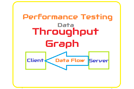
Throughput Graph
The throughput graph consistently shows a lack of attention. Because it is not listed in the NFRs, one explanation is that a performance tester does not recognize its significance or does not give it any thought. Naturally, it is true that throughput does not belong in the group of basic performance metrics, but that does not imply it should be disregarded. Let’s attempt to comprehend why throughput graphs are crucial for performance testing.
According to the common definition, throughput is the quantity of information a system can process or send in a specific length of time. You can receive two definitions if you use both LoadRunner and JMeter. Throughput in LoadRunner refers to the volume of data transmitted from the server to the client. JMeter, on the other hand, displays the number of requests made to the server by clients. Despite the fact that JMeter has distinct graphs for “sent bytes” and “received bytes.”
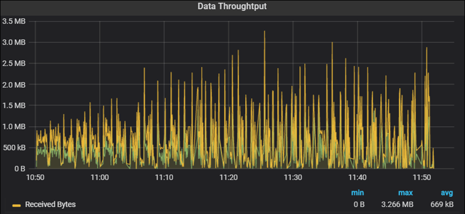
We will cover the ‘Throughput’ graph from LoadRunner or the ‘Received Bytes’ graph from JMeter here.
Purpose
- To measure the amount of data received from the server in bytes, KB, or MB
- To identify the network bandwidth issue
Throughput Graph axes represent:
- X-axis: This graph shows elapsed time on X-axis. The elapsed time may be relative time or actual time as per the setting of the graph. The X-axis of the graph also shows the complete duration of the test (without applying any filter).
- Y-axis: It represents the amount of data received from server to client (in bytes/KB/MB)
How to read:
The graph line displays the quantity of data delivered by the server at intervals of one second. As I said in the section describing the graph’s function, a throughput graph may be used to determine whether there are (if any) network bandwidth problems. An issue with network capacity can be seen in a flat throughput graph along with an increase in network latency and user load. In addition, if throughput decreases over time as the number of users (load) rises, this suggests that the server end may be the bottleneck. In such instances, to pinpoint the precise bottleneck, you must integrate the throughput graph with the error, user, and response time graphs.
Merging of Throughput graph with others:
- Combine the User graph with the Throughput graph to better comprehend the pattern. In a perfect world, throughput would rise as users scale up. More data arrives from the server as the number of users grows. Throughout the test’s steady state, the throughput graphs ought to stay within a certain range. During the steady state of the test, if you see a rapid drop in throughput, this suggests a server-side problem. What’s the problem? something has to be looked at using server logs.
- Another possibility is when throughput plateaus as the number of users rises, which may result in a bandwidth problem. You must combine the throughput graph with the latency graph in order to verify the bandwidth issue.
- With the Network Latency graph: You must examine the Network latency graph by fusing it with the throughput graph in order to verify the network bandwidth issue. If throughput improves but latency does not, the problem is likely with the network bandwidth.
- With the Response Time graph: The Throughput graph and the Response Time graph may be coupled. Issues with network capacity might be to blame for the rise in response time with steady throughput. Please see the latency graph for confirmation. Start your inquiry at the server end if throughput declines along with a rise in response time.
- A throughput graph may be used with an error per second graph to determine when an error first starts to happen and what kind of error it is.