
Correlate Method
You would have used the correlation for dynamic values while preparing scripts in Micro Focus LoadRunner. Have you ever heard about graph correlation? If your answer is No then refer to Graph Correlation post first. Because Graph correlation is the base of the ‘Correlate Method’.
Graph correlation is a perfect feature of the Micro Focus Analysis tool to analyse the test result and find out the issue. When you do graph analysis in separate windows, it is difficult to synchronize the time frame and also, it is hectic work to swap the windows every time. To solve this problem Micro Focus Analysis Tool has a graph merging option. This option merges the graphs and provides a single view which is helpful for issue identification. In Apache JMeter, you can open a result file (.csv/.log/.jtl) in the composite graph listener to use this feature.
By comparing the data, graph correlation establishes a link between performance measures. With its multi-tier design, many technologies, and connections to internal and external systems, software systems are inherently complicated. Therefore, correlating data is made simple by comparing end-user performance to server-side metrics. It is comparable to comparing the trend of one set of measurements, such as response time, with another set, such as CPU use of the web server.
What do we get by correlating the graph?
When two sets of data are related, an increase in response time reveals a potential subject for additional research and analysis since it reflects an increase in the number of users and heap size. Look at the graph below:
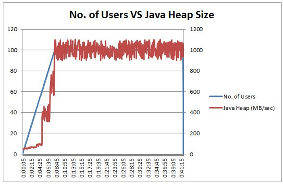
It demonstrates a relationship between server data and client-side metrics. The graph demonstrates a dramatic increase in heap size when the number of users reaches 40, and we can observe a similar pattern when the number of users reaches 70 and 100. It demonstrates the necessity for more research into the waste collector.
To pinpoint the precise bottleneck, you may combine the client- and server-side graphs.
What are the best graph combinations in Correlate Method?
Case 1: High Response Time without error
Correlate the Response time graph with the Data Throughput graph, Memory Utilization graph and DB Query Processing Time graph
Case 2: Error
Calculate a correlation between the Error graph and the Response time graph, CPU utilization graph, memory utilization graph, and DB query processing time graph.
Refer to Heap Dump, Thread Dump, and GC for further clarification on the main reason in addition to the graph’s association mentioned above.
Note:
If metrics are exactly proportional, the y-axis graph lines should ideally follow one another. Inversely proportional measures should otherwise show the opposite trend.
Example: During steady-state, the graphs of throughput and hits per second follow one another, whereas the graphs of errors per second and average response time follow the other way.
Step-up, step-down, and spike in the correlation graphs reflect the direction of the inquiry, while a linear line in the forward direction denotes successful results and the stability of the application.