
Transactions per second Graph
A transaction is a collection of requests sent to the server in a performance test script. Multiple requests connected to the components of a straightforward webpage could exist. The server receives these requests (sync or async) in one transaction when a user performs an action, such as clicking a button on a webpage. A transaction, in plain English, replicates a user action, such as logging in, searching, placing an order, logging out, etc.
Example: You can observe 1 dot entry in the “Transactions per second” graph and 10 dots entry in the “Hits per second” or “Requests per second” graph if a login page has 10 components and a transaction named “Login” that contains 10 HTTP requests (one for each component).
The number of transactions completed during the test is displayed on the transactions per second graph or TPS graph. You can determine the server’s capacity to handle transactions with the aid of the TPS graph. The system’s ability to handle transactions increases with the number of TPS and the application’s anticipated response time.
During live monitoring:
Monitoring the transaction rate is another goal of the Transactions per Second (TPS) graph during the live test. If the TPS rate exceeds the specified SLA, the pacing needs to be recalculated.
The Transactions per second NFRs should be considered and decided upon in accordance with the PTLC (Performance Test Life Cycle) during the NFR gathering phase. To gauge the application’s actual performance if it is new, you should ask the customer or business analyst for their projected TPS.
Term to represent the TPS graph in different tools:
- LoadRunner: Transactions per second Graph
- JMeter: Transactions per second Graph
- NeoLoad: NA
Transactions per second Graph axes represent:
- X-axis: It shows the elapsed time. The elapsed time may be relative time or actual time as per the graph’s setting. The X-axis of the graph also shows the complete duration of the test (without applying any filter).
- Y-axis: It represents the rate of transactions at a particular time.
How to read:
Throughout the live test, the TPS graph is quite useful. The obtained TPS rate is depicted on the graph, and it may be contrasted with the specified SLA. The summary table could provide the minimum, maximum, and average TPS. There may be 2 different TPS graph kinds available depending on the tool:
- Transactions per second
- Total Transactions per second
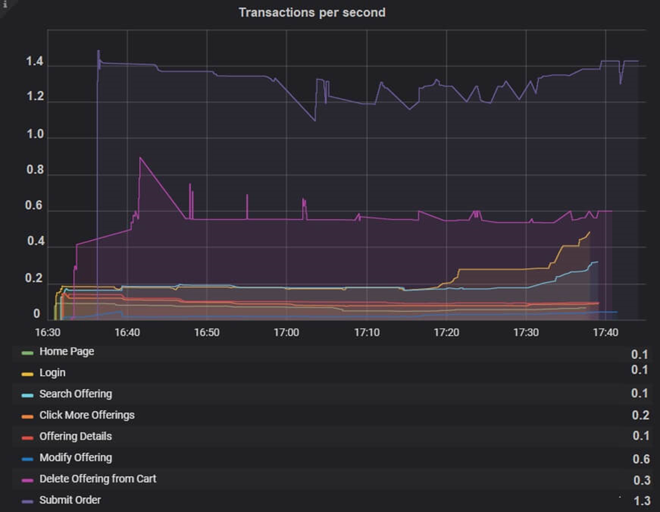
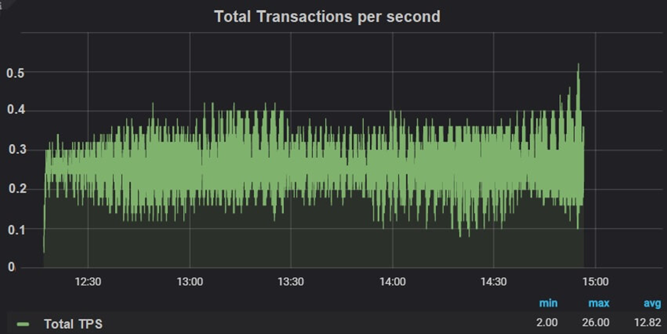
A descriptive version of the Total TPS graph is the TPS graph. While the Transactions per Second graph (Figure 01) displays the TPS rate for each individual transaction, the Total Transactions per Second graph (Figure 02) displays the overall TPS attained during the test.
As was previously stated, the achieved TPS should match the specified TPS; otherwise:
- Look at the reaction time graph. If the transaction response time exceeded the acceptable threshold for response time (or was noticed to be higher than expected) with constant pace and think time, this would have an effect on the TPS rate. Use dynamic pacing logic to find a solution such that reaction time may be modified by iteration delay.
- Recalculate Pacing and Think Time: Recalculating Pacing and Think Time is necessary if there is no problem with the reaction time. (The calculators Constant Pacing and Think Time)
- Increase in users: Regardless of whether user count is provided in the NFR, if you have previously provided real-time pacing/think time and reaction time is also fulfilling your requirements but you are still obtaining lower TPS, you must increase the number of users.
Merging of TPS Graph with others
- With no. of users graph: You can merge transactions per second graph with running Vuser graph to understand the downfall in TPS rate. One of the reasons could be the exiting of the users from the test.
- With Response Time graph: Merge the Average transaction response time graph with the TPS graph to see the effect of the number of transactions upon the performance of the transaction. An increase in response time impacts transactions per second inversely. Due to high response time (with constant pacing and think time setting) you will get a reduction in the TPS graph.
- With Throughput Graph: Ideally, the transactions per second graph should be followed by a throughput graph. If it is not the case then you need to check the error or network latency graph. Before concluding the result, consult other graphs too.