
User Graph
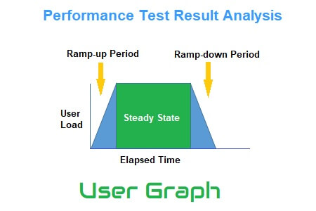
A User Graph provides complete information about the load patterns during the test. This graph helps to identify:
- When did the user load start?
- What were the user ramp-up and ramp-down patterns?
- When did the steady-state start?
- How many users were active at a particular time?
- When was the user exited from the test?
The number of users presently using the program is shown in the runtime viewer via User Graph. The User Graph displays a real load pattern that can be compared with the specified workload model of the test when you conduct a step-up test or spike test. One of the greatest ways to verify the live workload model is to do this. Thus, this graph is both straightforward and significant. It is simple’ because anyone with a rudimentary understanding of graph reading can quickly and easily interpret this graph. It is also a crucial graph since you may combine it with others to find the bottleneck, such as response time, error per second, throughput, latency graph, etc.
Every performance testing tool has its own term to represent user graph, some of them are below:
- LoadRunner: Running Vuser Graph
- JMeter: Active Threads Over Time Graph
- NeoLoad: User Load Graph
User Graph axes represent:
- X-axis: It shows the elapsed time. The elapsed time may be relative time or actual time as per the graph’s setting. The X-axis of the graph also shows the complete duration of the test.
- Y-axis: It represents the number of users (load).
How to read:
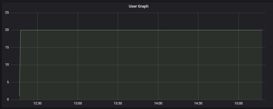
The graph line displays the user load on the program. The number of users at a specific time may be obtained by hovering the mouse over the line. The test’s ramp-up, ramp-down, and steady-state patterns can also be verified. For a newbie, a ramp-up period is when the user load gradually grows, a ramp-down period is when the user load gradually reduces, and a steady-state begins when all users are actively using the program. Ramp-up and ramp-down durations can be skipped when analyzing application performance using the steady-state window. Normal load tests have a steady state that looks like a horizontal line, however, stress tests could have an angled load pattern.
Merging of User Graph with others
Using the Response Time Graph: Combine the User Graph with the Response Time graph to observe how the number of users affects the application’s response time. For instance, you can confirm that users shouldn’t be able to leave the test due to a delay in response. Find the problem if that is the case.
To determine the pattern of the data flowing from the server, combine the User Graph with the Throughput Graph. The throughput graph shouldn’t suddenly increase or decrease. The throughput graph should have a continuous, regular pattern at steady-state with a constant load.
You may quickly determine the precise moment the first error occurred as well as how long the error will remain when using the Error Graph: User Graph when overlaid with the error/second graph. A rise in error% during ramp-up often denotes an error caused by the load. If an error is found in the middle of a steady state, this may be due to a server queue pile-up (a lot of unprocessed requests at the server end) or another server-related problem.